Today we added colour and texture to our scuplts from last week. Unfortunatley due to a USB loss (Bad work managment and my hope that whoever took the USB has suffered in some way by now) I lost the original creature file which I created last week. So I had to create a new sculpt, here it is.
I went for a different idea this time as I wanted to create an animal similar to a rhino or horned dinosaur last week, but went with my second idea as I thought a 2 legged predator would be easier. With this file I went into the workshop ready to add colour and texture to it.
Here it is.
The brush and texture could use some more work, but I do feel like the monster has become more alive after the addition of colour. But this is still only half complete, there was still the bumps to add to the design.
Which I have done here.
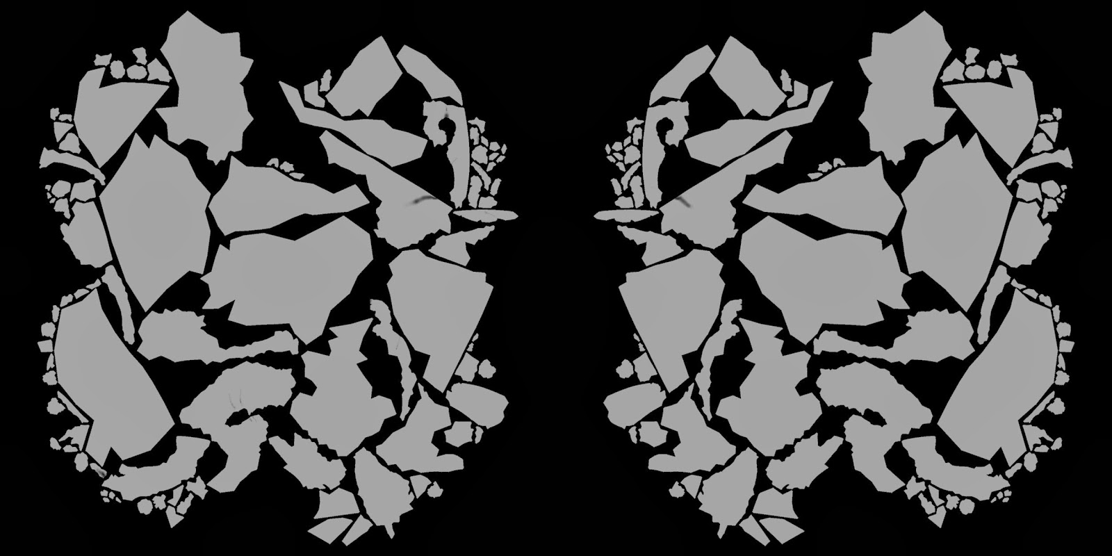
After turning symmetry off, I was able to add unique scars to the creature, to make it more realistic and imperfect, which it would be like if it was alive, especially an animal like this, with a heavy horned face to battle and defend itself with, and so would see a lot of beatings. I also lightened the brown on the top to make it fit in better with the other colours, and a more analogous colour scheme, which most creatures have on their skin. Here are also the Texmaps for the design.
So far I am very happy with my sculpt work. Im enjoying it aswell. I am curious to know what my first design would look like with the colour, textures and bumps. I might re attempt the first design and see how itll go.
Next week, I'll be putting the head on a body that will animate. I'm confident that my design will work.


No comments:
Post a Comment