Session 1
The fourth week was the first time our work was not drawn concept, rather it was to use photoshop for the first time, and to use blah when designing. We began by finding 3 images online, and then cropping the images twice, to create one good and one bad crop of the image that does/ doesn't follow the rules of imagery.
Here are the results.
1.
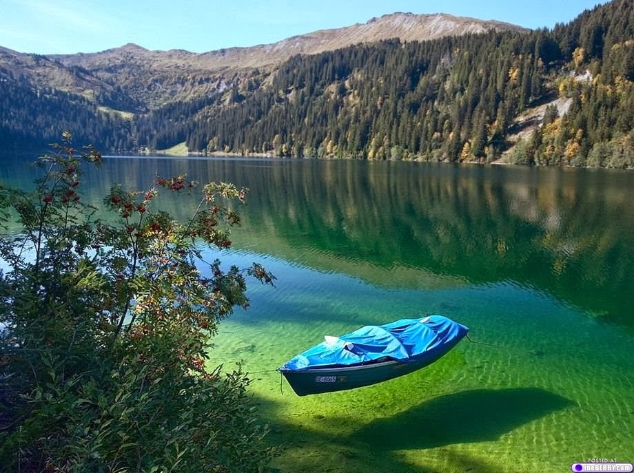 |
| Original |
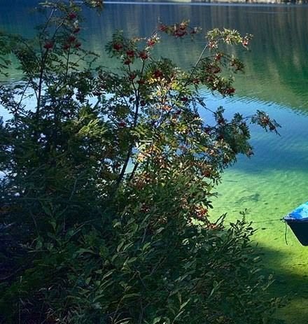 |
| Bad Crop |
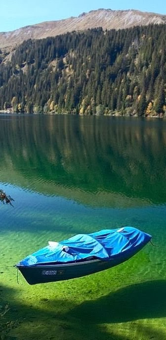 |
| Good Crop |
2.
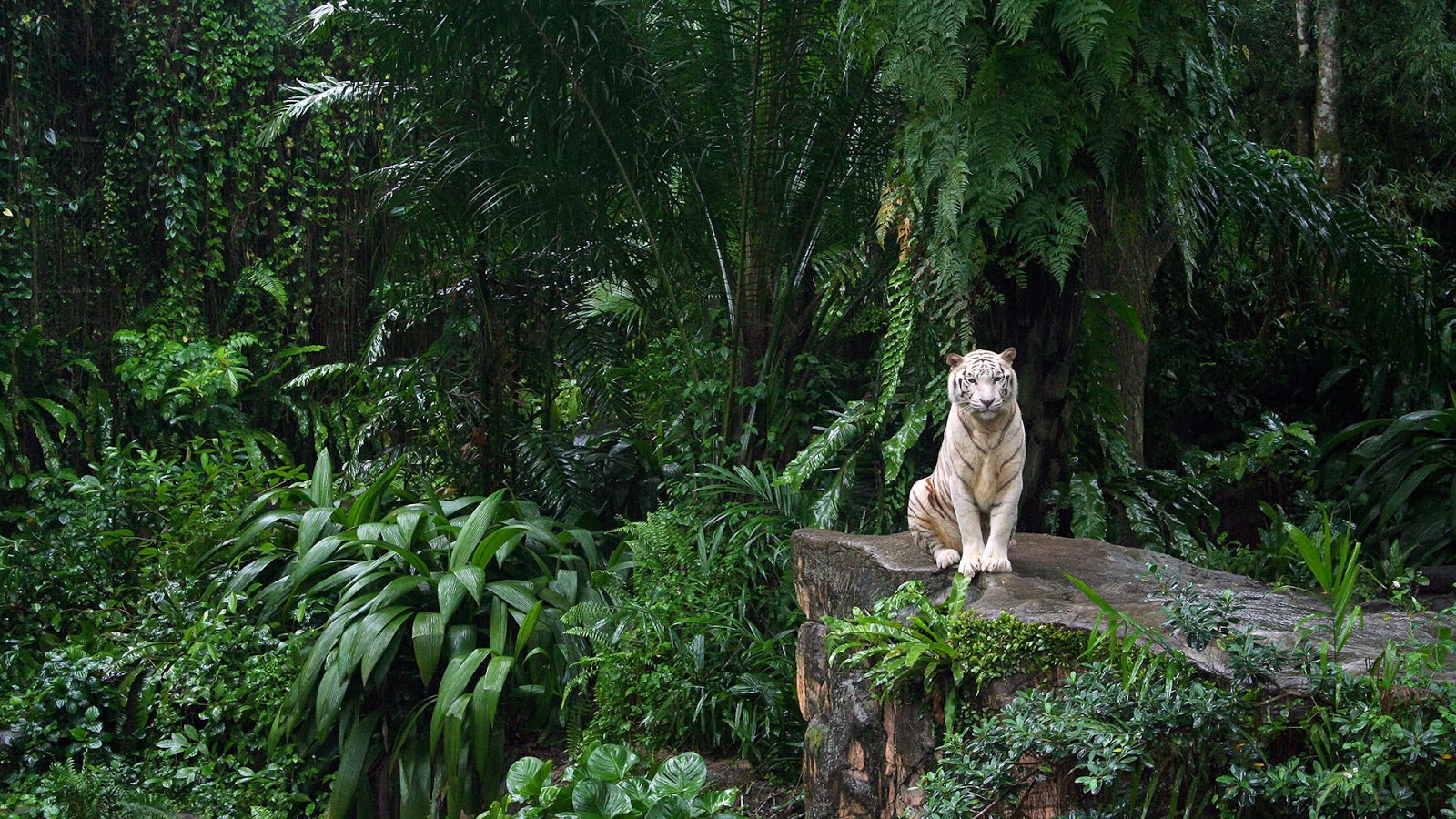 |
| Original |
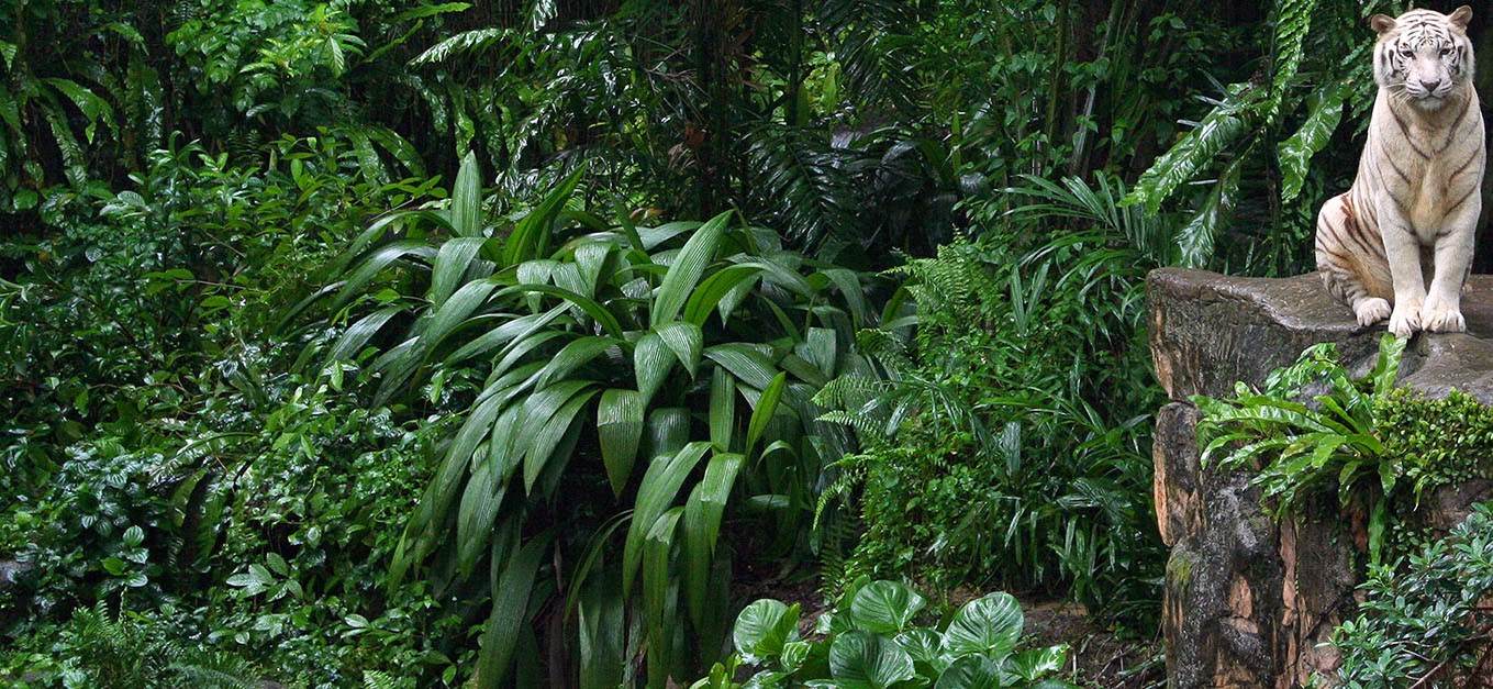 |
| Bad Crop |
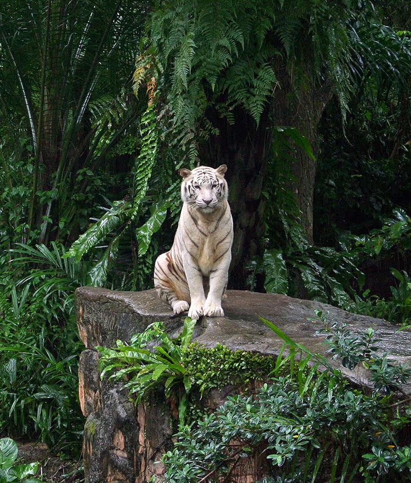 |
| Good Crop |
3.
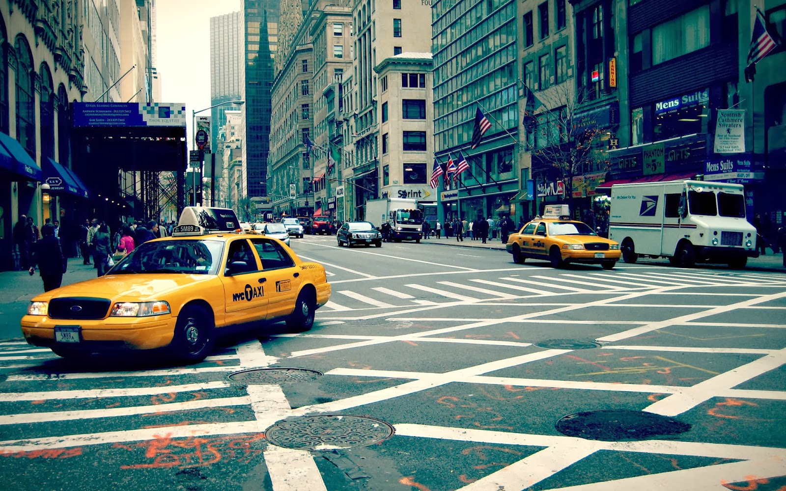 |
| Original |
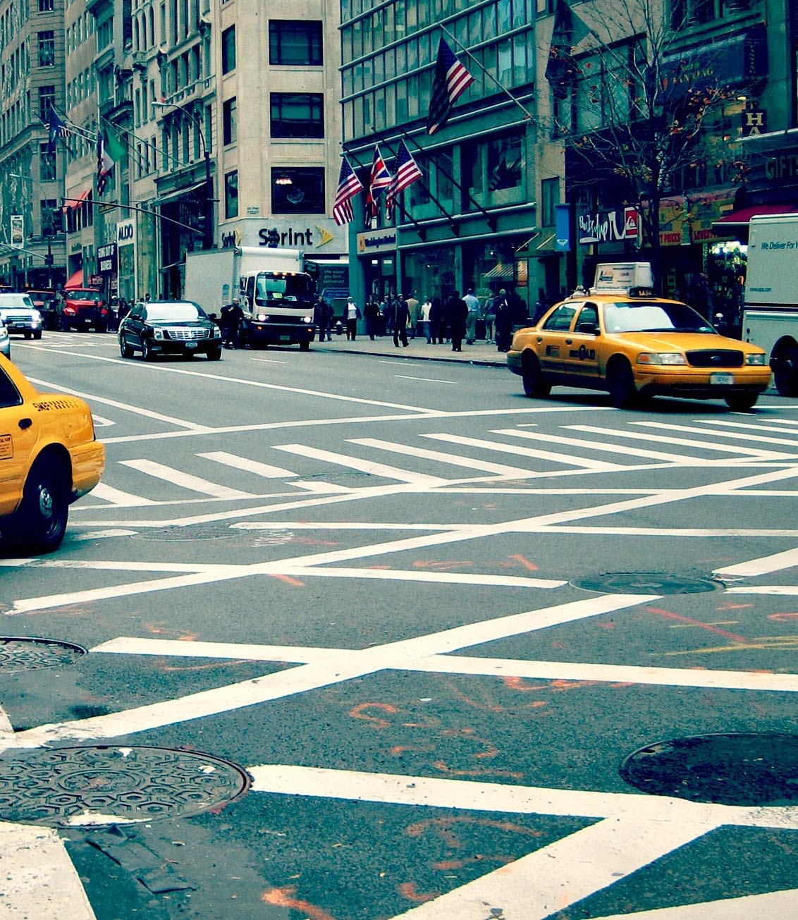 |
| Bad Crop |
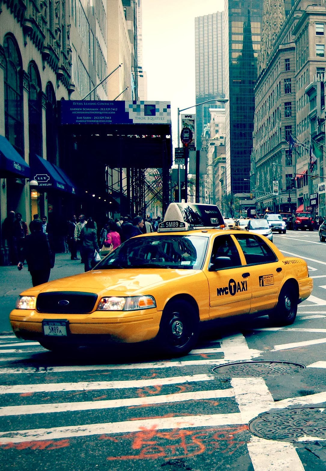 |
| Good Crop |
I feel like my work on this is good. I feel like I do have more to learn and understand about composition. But feel like I have made a good start.
Session 2
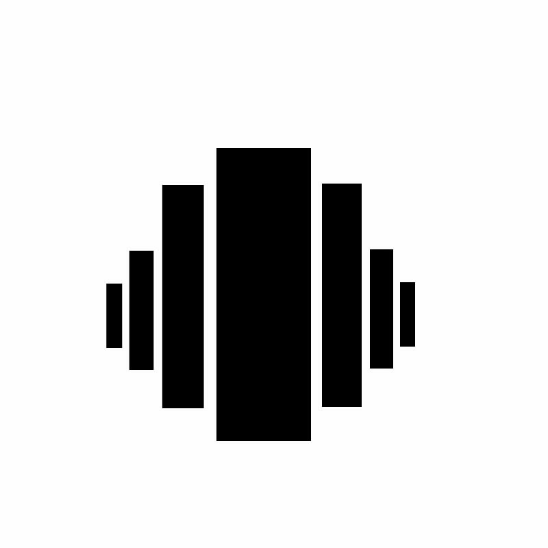
In the second session we focused on abstract composition. Given a group of words we were to create 8 abstract images using simple black shapes to show the word chosen. Here are mine.
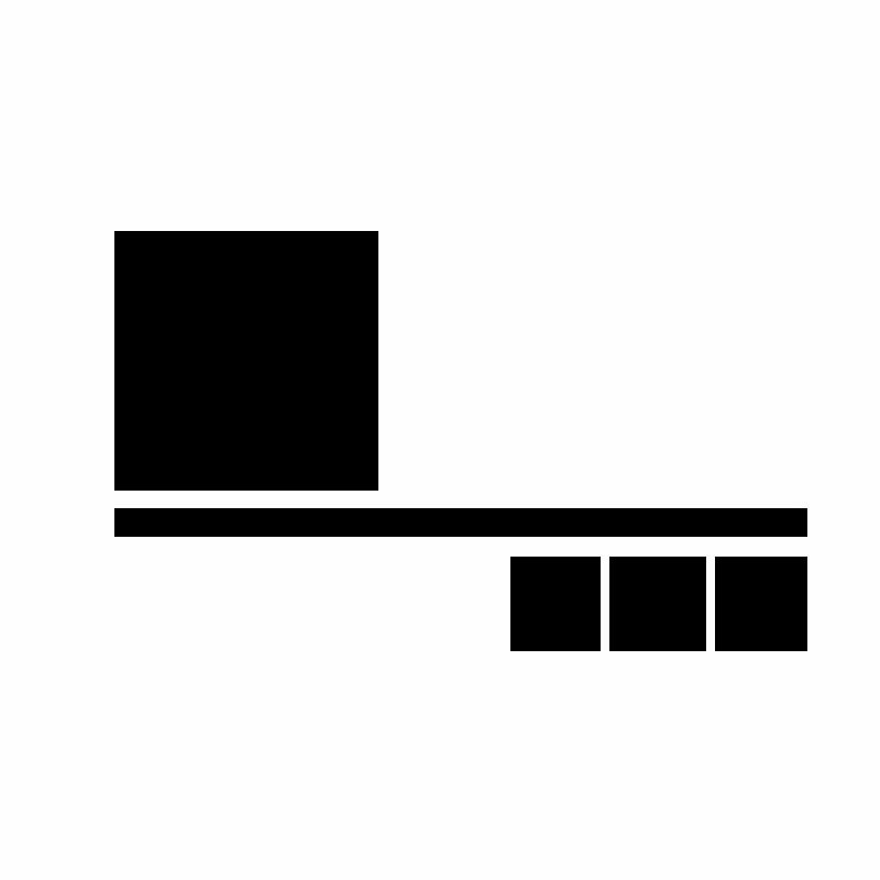 |
| Weight |
 |
| Direction |
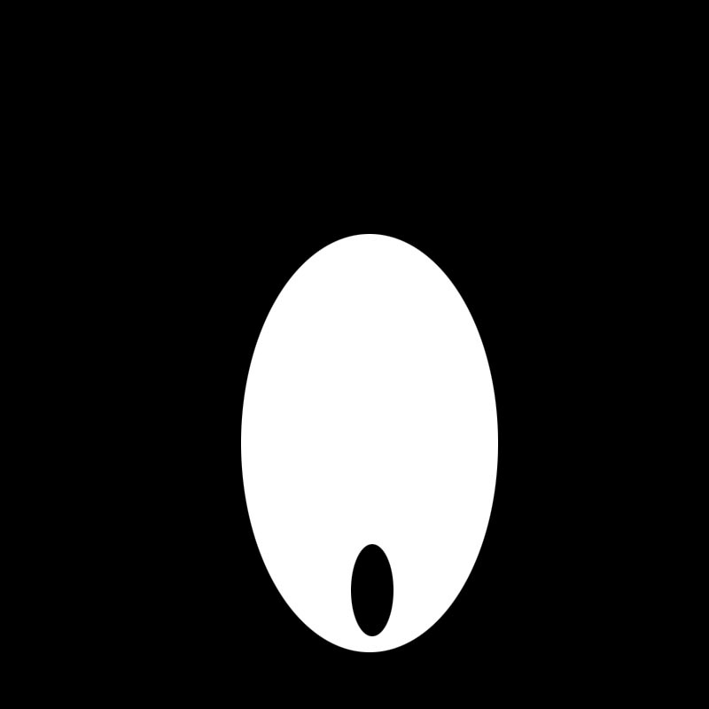 |
| Negative Space |
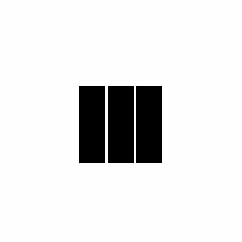 |
| Order |
 |
| Perspective |
 |
| Scale |
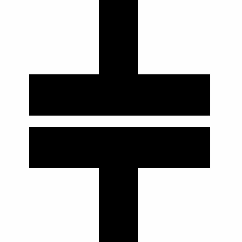 |
| Symmetry |
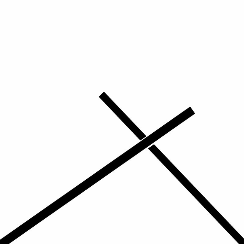 |
| Tension |
Although simple. I believe each image reflects the word chosen, and that Ive filled the learning specifications for this week.


No comments:
Post a Comment