Friday 16 May 2014

VFX Project - Target Down

Here is my second semester VFX project.


We were split into groups of 3 for this project. As Vnay and I had only joined this semester, we decided to go with Sams idea for the film. His original idea was to transfrom the campus into an ocean, with the buildings turned into floating forts which were being attacked by gunships. In my mind he had been inspired by the setting of the video game Bioshock Infinite.


But after discussing with a visiting guest lecturer, he explained how much work it would involve, and perhaps too big of a project for level 4, especially with 2 of the 3 having transferred from a BA Animation course. Eventually we came to an agreement on a more appropriate project, with a smaller scale.

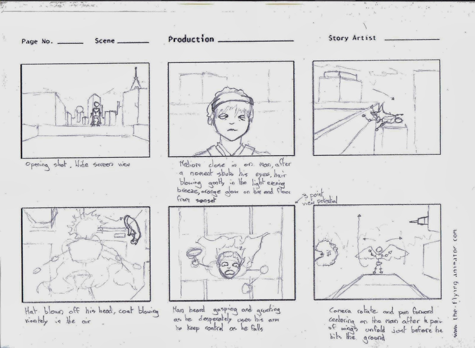
The new idea was for the campus to be turned into a military depot with a large turret positioned on the roof, being attacked by a single gunship, which would eventually crash, and call in an unmanned drone for support and destroy the turret. We agreed to spread out the work, so that we would each be doing work using the information and skills we had learned in all 3 modules of this semester. So, when time came to draw up a first drafft storyboard, all 3 of us came up without own storyboards, to see what each of us had in mind for the shots and scenes. Afterwards we all came together and compared/merged the storyboards, and created a 'final' storyboard which we would work from.


I believe this step was a success, as all of us had an input, and our opinions respected by one another, even if the original idea was from Sam. We each would have one object which we were responsible to model, aswell as the scene it was involved in. I had the turret, Vnay the helicopter, and Sam the drone/missiles.


The turret was originally going to be on 3 hydraulic lifts, but after discovering that we would not be allowed to film on the roof, or anywhere high enough to get any usable raw footage of where the turret would be, the hydraulic liffts wouldn't be very visible in the film. As the base is stationary the rigging for this only need 2 bones, one in the turret head and the barrel.

We filmed over the course of 2 days, as we did not have the costume accessories for the pilot scene. Unfortunately the weather was different on both days, but we hoped that in editing we could make this fact less obvious, especially considering that we would be replacing the sky. The light and shadowing on the grass and buildings was a different story.

I did a bit of matte painting for the project using photoshop. Some proved harder than others. The matte painting I did of the James Gray building was quite straightforward, just had to use the magic wand tool to separate the sky (so I didn't need to when taking it into After Effects), then paint out any people caught in the photo, aswell as cover the sign outside with the logo I had created.

Before
After
I also matte painted the roof for the front shot of the turret. I used graphics found from footagecrate.com to create it. aswell as broken brick walls I found online.

Before
After
The hardest painting I needed to do was the forced perspective from the top of the James Gray building. Since I couldn't shoot on the roof I needed to take a photo taken on the front steps and make it seem as if it was taken from the roof. I raised the treeline, duplicated the houses and enlarged them, aswell as creating a wall which would be on the roof infront of the turret. This was the hardest matte painting to do, and I think it could be much better, but as this project was the first time I had to matte paint a forced perspective, I think its a good attempt. As you can see the left side isn't 'finished' since it wouldn't be seen and is only going to be used in one scene.

Before
After
After I had rendered out the turret animations as PNG sequences and imported them into after effects along with the matte painting/raw footage, it was time to add the effects.


I created some effects myself, primarily the smoke trail, using the Particular effect in the Trapcode plug in and a cloud image I keyed. Any I could not, such as a puff of smoke or gunfire, I used royalty free FX from the same website, footagecrate.com. I used the same website to gather some of the audio used in the film, as I was responsible for the sound, aswell as putting all the sequences together at the end of the project and rendering out the final film, after receiving my other team mates work.


Overall, I am disappointed in the final film, and the work I contributed. I believe sam's drone scene is the best sequence made, although the smoke trail at the end could have been improved, or at least lengthened, I was also happy with the smoke trail I created for vnay's helicopter rockets, although improvements could've been made for it to fit the scene better. I do like the opening, but as pointed out, the layout is not similar to a newspaper headline, which makes it obvious that its not real. If I had kept to the template of the newspapers I researched, the scene could've been improved greatly. I also could have invested more time into modelling the turret, it is too smooth and simple in shape to realistically be a large turret that would actually be implemented on a military base. I believe poor time management and at times communication problems between the team would be the best way to explain the reason for the films standard. Although at the beginning I felt that the 3 of us having an equality in everything said and done on the film would be a positive, the lack of a leader in the group caused the work and members to drift on parts of the work. I had not planned on having to act as a leader of some sorts towards the end of the project (contacting the others to see what work they were doing today/tomorrow, walking round to see what task was currently being done) especially considering that I had just joined this semester, and new to group work. I believe if one of us had stood up and made ourselves known as the leader of the group at the start, the work would have had better organisation and stricter self initiated deadlines. Over the summer I will use 3ds max to keep myself capable in it, but also to actively improve my skills in it, trying for more ambitious designs and not sticking to just what I have learned this semester. Also to practice and improve my materials and lighting, the latter of which I am still having difficulty to get an eye for what is right.

I hope that the disappointment I feel about the work I did on this project will give me the push to strive for more quality in what I create, and to criticise my work much harder on future projects, to create something Id be proud to display.

Friday 14 March 2014

Self Initiated Work - Bionic Human

I have finished the design for the Bionic Human, and fulfilled one half of the brief I initially set myself.

After drawing so many ideas and varying concepts in the sketchbook, and looking at dozens of images online, aswell as my moodboards, I felt like I was ready to begin work on the final design.

I decided to draw the final piece directly into Photoshop, although I was sugested to try Adobe Illustrator, It just wasnt comfortable to me. Im used to the layering system in Photoshop, and how to use it efficiently to draw and colour, while Illustator seemed a bit too ineffective, also the brush movements were out of sync with my drawing tablet, and slow to appear on screen, this is probably an eroor due to the instillation. I will return and try Illustrator again, but for this final piece, I decided to go with a program I knew well, instead of using it to 'experiment' with a new program.

Here is the final design.


I am very happy with the result. I used an online 3D image of  the human body as a template to draw on. since this was a side project, and didnt want the human body proportions or size be an issue (since the brief focused on designing a bionic human which was part man, part machine, aswell as a mech which it could pilot, and not accurately measuring and drawing a realistic proportionate human) I used it as an 'outline' to build on. Which I feel was the most efficient way to go about it. I was able to focus on the details of the design, instead of worrying about going off track and messing with the proportions of the body.

As you can see from the image the most obvious inspiration for my design was the armour design from the video game - Haze - which has a similar colour scheme and helmet.


I am happy with the colour scheme I have chosen for it. I have always like the contract between the varying tones of yellow and grey, one that I feel is not too gawdy, and practical in a militaristic or battle role (grey being a common find in this role, but also a neutral colour that goes with everything), but still appealing, and draws the eye to it with the noticeable bright colour. I have saved a version of the design before I added the colour, which I can use of I decide to try another colour scheme.


I believe I've fulfilled the ask of the brief, for a bionic humanoid that is both man and machine. Although the living, human side may not be obvious, it is practical, and realistic. If a human was damaged to the extent which it needed permanent artificial and life supporting technology surgically added to it to survive, odds are it would cover a large percentage of the body.

Thursday 13 March 2014

Graphic Design - Week 06

This week the goal was to create 2 storyboards of 2 different scenes.

The first scene was -

'A man returns home, it is night time and there is a street lamp outside his house
He puts the key into the lock of his front door, it swings open, casting light from outside into the hallway. He tries to flick on the light switch, it doesn't work. The man looks to his right and notices there is a broken window. H etakes a few tentative steps forward, he notices that he telephone is off its hook, beeping. He gasps in surprise. A knife appears. Darkness.'
  
Here is my storyboard, which was asked to be 12 panels.


I felt like it could be better, and that some shots are a bit dull or common. I believe its more difficult to show suspense in storyboards than other moods. Although these storyboards are only rough ones, the images created need to be precise when trying to portray suspense in the scene. But I do feel like I've made good additions to the scene, such as the hat dropping when the camera shots in from the broken window.

The second scene was -

'A figure is standing on a ledge at the top of a tall building. Eyes closed, the the figure tips forward into the empty air, arms outstretched. Falling fast and uncontrolled, the the character's face looks scared and helpless... but then two large wings appear to unfold from its back, from beneath its long black coat. The character looks relieved and happy, and with its new wings fully extended, it glides off into the heart of the city...'

Here is my storyboard for it, which was asked to be 9 panels (or less if possible)


I feel this is better than my first one. I think its because I preferred this story, as it was more action orientated, rather than suspense. I also managed to fit it into 6 panels. I felt like the scene didnt need anymore shots and rather kept short and sweet, as the scene came across to me when I read it.

3D Graphics - Week 06

This week our task was a challenge, to recreate one of 4 images in 3ds Max. After looking at the options, I decided to go with this image.


I went with this image since it seemed like a reasonable amount of difficulty, considering we only had 3 hours to do it. My initial thought was that the table cloth would be the most difficult object to create.

Here is a render of my results.


I am very happy with the result. I had luck with the cloth, as I managed to create the folds and creases relatively quickly, and similar to the folds in the image, although I didn't have the time to modify it to be fully under the bowl of grapes like it is in the image. The wine colour is also wrong, and should be a darker orange colour, but I couldn't find a middle ground between orange and red, and with the limited time frame went with the best I could get, the grape stem also needs to be changed to green. These problems are relatively small, so I'm not worried about them, since I know how to correct them, which is the main issue at the minute, getting to grips and understanding the software.

This was also the first time I had the camera animating. I feel like I did well with the it, although I feel like I could've done a better job at the lighting and shadows, and possibly the shine of the fruit, but with the 3 hour time frame I felt like I've done well.

Wednesday 12 March 2014

Video Editing - Week 06

This week in video editing, the aim was to use Autodesk MatchMover. We were given worksheets to instruct and guide us through the exercise.


The first exercise - Tracking an Image Sequence - went well. Some of the details in the worksheets were a bit confusing, but eventually it started to make sense, and I was able to render it as an image sequence. Overall the lesson was 'simple', aslong as I followed the guide exactly, there are many tiny details which are easy to miss out,

The second exercise - Using supervised , went better than the first I believed. Placing the track points, and subsequesent ones, and then editing them, was easy to get my head around after following the guide. Calibrating the camera  and creating coordinate system took a few attempts for me. It was mainly me just overlooking points, and then having to redo it, before adding the 3D objects.

The final exercise - Object-Based Tracking - went well. I successfully imported the 3D mesh, and set up the trackers and survey points. One thing I did wrong was forget to open the magnifier window, which caused me to hit a wall with the guides images, and waste a bit of time. But overall it went well, and I was capable to fulfil the goal of the lesson.

Overall I believe that I understood and learned how to do the lessons in the guides. It will take a few more attempts before Ill be able to do them without the guidebooks nearby, but will progress.

Tuesday 11 March 2014

Self Initiated Work - Mech Arm Colour Schemes

I wanted to experiment with colour schemes again, after the weekly task where we focused on it. Therefore I imported a design of a mech arm from my sketchbook into Photoshop. Here is the  original image of the sketch that I built and worked on in photoshop:


As you can see, its just a photo snapped with my phone , and not as high quality as a scan, but since Id redraw it in photoshop, it didnt really matter, aslong as the lones were bold enough for me to see.

From there I redrew it in photoshop, and then experimented with the 3 colour schemes we focused on in one weekly task, to see which worked best.

Here are the three versions:

Analogous

Complementary

Triadic

I believe all 3 work on the arm design in their own way. But I personally prefer the complementary colour scheme. I feel its more tactical, and in line with the mood and purpose of the arm when I first envisioned it attached to a battle mech. The anaologous scheme, to me, gives the impression that its a maintenance or support mech. While the triadic scheme doesnt give me an idea oh what 'role' the mech would have, but regardless I think the colours work well with eachother.

I feel this activity was beneficial, as its shown me that I dont always need go for an anaologous scheme when colouring in mechs or other robotic inspired designs. its also given me an idea to try and draw into Adobe Illustrator, instead of Photoshop, since it would be a better program to use, for the smaller files size alone.

Saturday 8 March 2014

Self Initiated Work - Bionic Arms

Following my concept designs, I went to create perspective views of bionic/robotic arms. I decided to use them on photoshop, as the layering system would be useful when using photos of my own arms as a base to design the robotic elements on. I believe they came out well.

My first design was steampunk inspired, with exposed gears, tubes, lights and wiring, aswell as small smoke and steam chimneys.


I believe the analogous colour scheme I've used is appropriate, and in line with what is seen in 'steampunk' designs, with a deep earth colour to it, aswell as a copper feel. The open case and exposed internal wiring makes it more realistic I feel. There are a few problems with the design, the most obvious is the largest gear, its too large for the slot its meant for, and seems to have popped out. This was a rather silly mistake on my part, one that I didn't notice until it was finished. But overall I am happy with this design, and the perspective view adds to it. A view I will use in my second one.

Here is my second bionic arm. This time I went with a more futuristic feel.


I wanted to show the combination of metal and flesh in this design, which I believe I've done well. I had originally planned on having a clear screen covering the exposed flesh and bone, but felt it would've looked stupid, and out of the place with the colour and style of the arm.

I replaced the index finger with an entirely robotic segment, thin and sharp, to mix up the design of the hand, and create a more interesting and unique limb. It could be used when creating a 'story' if the design was worked on further, perhaps that it can be inserted into computers or hard drives and used to transfer files and data, or viruses for example. I also added in a yellow to make the design more appealing, Ive always thought yellow and a dark metallic complemented eachother.

Thursday 6 March 2014

3D Graphics - Week 05

Session 1

This weeks work we followed the booklet a lot more closely, bringing elements together to create impressive results. There were some moments where we needed support from the tutor, but these were moments that most of the students had difficulty, so we were shown how to work through it when most came to it. Overall it wasnt too difficult, as the booklet was quite detailed in its steps (with one or two confusing moments). 

The task was to add a piece of film as a material to a shape. As I said before the booklet was quite specific in the steps required, plus we were given film to use, so didn't have to waste time finding something appropriate from online. Here is the result.


In fact, the hardest part of this task was rendering it out correctly, but after going through the modify list and what the booklet said, It was just a wrong mouse click that was responsible. Although very simple looking, I am amazed with it, and the capabilities of 3ds max. This is a feature that will hopefully come back to be used again in my work.

Session 2

In the second session we continued in the booklet, and this task was a bit more complex. It was to create a glass filled with ice cubes, on a table with a wall behind it, including shadows and reflections.


 Here is the first render of the scene. As you can see there is a shadow and reflection on the table material. Although the inside of the cup is not visible, It is still correct and I followed the steps. From here I worked on the cup material. After creating a suitable jpeg on photoshop to be used as a bitmap in the material modifier, I added it to the material, although it still looks a little like plastic, it is slowly getting to the glass look.

Bitmap made on Photoshop


Here is what it looked like after the addition. One problem with the scene is that its slightly too bright, so I went back and dimmed both the omni and target light. I think more is visible and now, and is much better.


From here, I changed the amount of diffuse and added noise to make the glass look slightly more realistic.


As you can see the glass in the second image looks much better. Now just to add the ice cubes.

Although I followed the steps, I believe I've made the parameters of the cubes wrong, and they look very similar to the glass material. Ive experimented with it, but the best outcome I could get was this.


Its not bad, but could be better, at the moment right now Im not sure what to do to the cubes to make them rougher, but will soon, hopefully. Overall Im happy with the scene Ive created, the glass actually does look like glass, and the shadow and reflection on the table is good.


Graphic Design - Week 05

Session 1

In the first session we focused on the use of colour in Photoshop, another essential needed, along with composition, when creating a framed image. The aim was to colour in 3 templates, to show and practice with colour schemes.

Here are my results.

Analogous

Complementary

Triadic
I believe that I've learnt the learning specifications of this task. Although I've experimented with colour many times before, and believe I can practically use it, I didn't know the correct terms for the schemes used until this weeks task. The task itself this week wasn't too difficult I thought, since it was just using the fill option mostly, with some smudge tool in the analogous.

Session 2

In the second session we continued with our colour work, by importing black and white images into photoshop, and then adding colour to create an atmosphere.

From a list of images provided we were to pick 3, and for each creating one of the 3 moods needed. Here are my results.

Moody and Dramatic

Light and Cheerful

Dark and Depressing

I believe the light and cheerful image is the best of my 3 attempts. But feel like the other 2 could use some work. The Dark and Depressing could perhaps use more colour, but as the image had a lot of dark with nothing visible, it was difficult to do more than I have done. I also didn't want to overdo the blue, and create an image that looked too much like a flooded street. Im fairly happy with the Moody and Dramatic image, but did make another attempt, but for a Light and Cheerful mood, I also added the colour onto the background instead of a multiple layer, to see the effect. I believe it came out well.


I believe it has a similar level of realism as my other Light and Cheerful image. I used examples of sunsets from online, and what I knew in my mind of how the lights meld together. Overall I believe I've been successful in this weeks work, and can effectively apply it to my future work.

Wednesday 5 March 2014

Workshop - Sculpting Session 2

Today we added colour and texture to our scuplts from last week. Unfortunatley due to a USB loss (Bad work managment and my hope that whoever took the USB has suffered in some way by now) I lost the original creature file which I created last week. So I had to create a new sculpt, here it is.


I went for a different idea this time as I wanted to create an animal similar to a rhino or horned dinosaur last week, but went with my second idea as I thought a 2 legged predator would be easier. With this file I went into the workshop ready to add colour and texture to it.

Here it is.


The brush and texture could use some more work, but I do feel like the monster has become more alive after the addition of colour. But this is still only half complete, there was still the bumps to add to the design.

Which I have done here.


After turning symmetry off, I was able to add unique scars to the creature, to make it more realistic and imperfect, which it would be like if it was alive, especially an animal like this, with a heavy horned face to battle and defend itself with, and so would see a lot of beatings. I also lightened the brown on the top to make it fit in better with the other colours, and a more analogous colour scheme, which most creatures have on their skin. Here are also the Texmaps for the design.


So far I am very happy with my sculpt work. Im enjoying it aswell. I am curious to know what my first design would look like with the colour, textures and bumps. I might re attempt the first design and see how itll go.

Next week, I'll be putting the head on a body that will animate. I'm confident that my design will work.